Chapter 4 Introduction to UI Components and Practical Applications (Part 3)
Through the previous chapters, we have gained a preliminary understanding of OpenHarmony's fundamental components and layout approaches. In this chapter, we will reinforce this knowledge by integrating multiple components through a comprehensive digital clock example. This demonstration will illustrate how to leverage OpenHarmony's animation capabilities, state management, and components such as sliders and toggle switches, enabling you to better grasp and apply the ArkUI framework in practical scenarios.
1. Demonstration Example
Based on the content covered in previous chapters, we now have a foundational understanding of essential components. For those seeking deeper insights, comprehensive resources are available on the HarmonyOS Official Website.
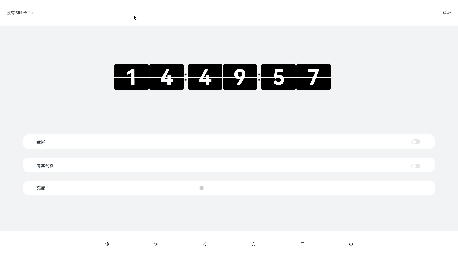
We will implement a dynamic digital clock that displays real-time updates and includes the following features:
Core Features:
Real-time Time Updates: Implement a page-flipping animation effect for digit transitions.
Brightness Control: Dynamically adjust screen brightness using a slider component.
Fullscreen Mode Toggle: Switch between fullscreen and standard modes using a toggle switch component.
Key Components:
Text Component: Displays time values with animation effects.
Slider Component: Binds to brightness adjustment functionality.
Toggle Switch Component: Controls fullscreen mode activation.
State Management: Synchronizes UI updates with system time and user interactions.
Text Component: Displays the clock digits.
Slider Component: Adjusts screen brightness via user interaction.
Toggle Switch Component: Enables full-screen mode toggle functionality.
Animation Feature: Enables digit-flipping transition effects.
1.1 Digital Clock Core Code Implementation:
    //修改时间
	changeTime(): Array<number> {
		const time = new Date()
		const hour = time.getHours()
		const hourOne = Math.floor(hour / 10)
		const hourTwo = hour % 10
		const minutesOne = Math.floor(time.getMinutes() / 10)
		const minutesTwo = time.getMinutes() % 10
		const secondsOne = Math.floor(time.getSeconds() / 10)
		const secondsTwo = time.getSeconds() % 10
		return [hourOne, hourTwo, minutesOne, minutesTwo, secondsOne, secondsTwo]
	}

	@Builder box(num : number) {
		Column() {
		Divider()
			.zIndex(5)
			.strokeWidth(2)
			.color(Color.White)
			.position({ x: 0, y: '50%' })

		Text(`${this.timeOne[num]}`)
			.zIndex(1)
			.height(108)
			.width('100%')
			.borderRadius(8)
			.fontWeight(700)
			.padding({ top: 0 })
			.fontSize(90)
			.position({ x: 0, y: 0 })
			.fontColor(Color.White)
			.fontFamily('Monospace')
			.backgroundColor($r('app.color.text_bg'))
			.textAlign(TextAlign.Center)

		Text(`${this.timeTwo[num]}`)
			.zIndex(2)
			.height(64)
			.width('100%')
			.fontWeight(700)
			.borderRadius(8)
			.padding({ top: 3 })
			.fontSize(90)
			.position({ x: 0, y: 0 })
			.fontColor(Color.White)
			.fontFamily('Monospace')
			.backgroundColor($r('app.color.text_bg'))
			.textAlign(TextAlign.Center)

		Text(`${this.timeThree[num]}`)
			.zIndex(4)
			.height(64)
			.width('100%')
			.fontWeight(700)
			.borderRadius(8)
			.padding({ top: 3 })
			.fontSize(90)
			.position({ x: 0, y: 0 })
			.fontColor(Color.White)
			.fontFamily('Monospace')
			.textAlign(TextAlign.Center)
			.backgroundColor($r('app.color.text_bg'))
			.rotate({
			x: 1,
			y: 0,
			z: 0,
			centerX: '50%',
			centerY: '100%',
			angle: this.angleOne[num]
			})

		Text(`${this.timeFour[num]}`)
			.zIndex(3)
			.height(108)
			.width('100%')
			.fontWeight(700)
			.borderRadius(8)
			.padding({ top: 0 })
			.fontSize(90)
			.position({ x: 0, y: 0 })
			.fontColor(Color.White)
			.fontFamily('Monospace')
			.backgroundColor($r('app.color.text_bg'))
			.textAlign(TextAlign.Center)
			.rotate({
			x: 1,
			y: 0,
			z: 0,
			centerX: '50%',
			centerY: '50%',
			angle: this.angleTwo[num]
			})
		}
		.height(108)
		.width('50%')
	}
1.2 Rotation Animation Code Implementation:
		animationOne(i : number): void {
		animateTo({
		duration: 250,
		delay: 0,
		iterations: 1,
		onFinish: () => {
			this.animationTwo(i)
			this.angleOne[i] = 0
		}
		}, () => this.angleOne[i] = 90)
	}

	animationTwo(i : number): void {
		animateTo({
		duration: 250,
		delay: 0,
		iterations: 1,
		onFinish: () => {
			this.angleTwo[i] = -90
		}
		}, () => this.angleTwo[i] = 0)
	}
1.3 Fullscreen Mode Code Implementation:
	this.isFullScreen = !this.isFullScreen
		try {
			let win = await window.getLastWindow(getContext(this))
			let names = this.isFullScreen ? [] : ['status', 'navigation']
			await win.setWindowSystemBarEnable(names as Array<'status' | 'navigation'>)
			}
Complete Code Implementation:
	import { brightness } from '@kit.BasicServicesKit';
	import { LockSwitch } from './LockSwitch';
	import { window } from '@kit.ArkUI';

	@Entry
	@Component
	struct Index {
	@State message: string = 'Hello World';
	@State timeOne: Array<number> = []
	@State timeTwo: Array<number> = []
	@State timeThree: Array<number> = []
	@State timeFour: Array<number> = []
	@State angleOne: Array<number> = [0, 0, 0, 0, 0, 0]
	@State angleTwo: Array<number> = [-90, -90, -90, -90, -90, -90]

	@State isFullScreen: boolean = false
	@State inSetValue: number = 40


	aboutToAppear() {
		const arr = this.changeTime()
		this.timeOne = [...arr]
		this.timeTwo = [...arr]
		this.timeThree = [...arr]
		this.timeFour = [...arr]
		setInterval(() => {
		const time = new Date()
		if (this.timeOne[5] != time.getSeconds() % 10) {
			const arr = this.changeTime()
			for (let i = 0;i < 6; i++) {
			if (arr[i] != this.timeFour[i]) {
				this.timeFour[i] = arr[i]
				this.animationOne(i)
				setTimeout(() => {
				this.timeTwo[i] = arr[i]
				}, 100)
				setTimeout(() => {
				this.timeThree[i] = arr[i]
				}, 150)
				setTimeout(() => {
				this.timeOne[i] = arr[i]
				}, 240)
			}
			}
		}
		}, 1000)
	}

	animationOne(i : number): void {
		animateTo({
		duration: 250,
		delay: 0,
		iterations: 1,
		onFinish: () => {
			this.animationTwo(i)
			this.angleOne[i] = 0
		}
		}, () => this.angleOne[i] = 90)
	}

	animationTwo(i : number): void {
		animateTo({
		duration: 250,
		delay: 0,
		iterations: 1,
		onFinish: () => {
			this.angleTwo[i] = -90
		}
		}, () => this.angleTwo[i] = 0)
	}

	setBrightness(): void {
		brightness.setValue(this.inSetValue)
	}

	//修改时间
	changeTime(): Array<number> {
		const time = new Date()
		const hour = time.getHours()
		const hourOne = Math.floor(hour / 10)
		const hourTwo = hour % 10
		const minutesOne = Math.floor(time.getMinutes() / 10)
		const minutesTwo = time.getMinutes() % 10
		const secondsOne = Math.floor(time.getSeconds() / 10)
		const secondsTwo = time.getSeconds() % 10
		return [hourOne, hourTwo, minutesOne, minutesTwo, secondsOne, secondsTwo]
	}

	@Builder box(num : number) {
		Column() {
		Divider()
			.zIndex(5)
			.strokeWidth(2)
			.color(Color.White)
			.position({ x: 0, y: '50%' })

		Text(`${this.timeOne[num]}`)
			.zIndex(1)
			.height(108)
			.width('100%')
			.borderRadius(8)
			.fontWeight(700)
			.padding({ top: 0 })
			.fontSize(90)
			.position({ x: 0, y: 0 })
			.fontColor(Color.White)
			.fontFamily('Monospace')
			.backgroundColor($r('app.color.text_bg'))
			.textAlign(TextAlign.Center)

		Text(`${this.timeTwo[num]}`)
			.zIndex(2)
			.height(64)
			.width('100%')
			.fontWeight(700)
			.borderRadius(8)
			.padding({ top: 3 })
			.fontSize(90)
			.position({ x: 0, y: 0 })
			.fontColor(Color.White)
			.fontFamily('Monospace')
			.backgroundColor($r('app.color.text_bg'))
			.textAlign(TextAlign.Center)

		Text(`${this.timeThree[num]}`)
			.zIndex(4)
			.height(64)
			.width('100%')
			.fontWeight(700)
			.borderRadius(8)
			.padding({ top: 3 })
			.fontSize(90)
			.position({ x: 0, y: 0 })
			.fontColor(Color.White)
			.fontFamily('Monospace')
			.textAlign(TextAlign.Center)
			.backgroundColor($r('app.color.text_bg'))
			.rotate({
			x: 1,
			y: 0,
			z: 0,
			centerX: '50%',
			centerY: '100%',
			angle: this.angleOne[num]
			})

		Text(`${this.timeFour[num]}`)
			.zIndex(3)
			.height(108)
			.width('100%')
			.fontWeight(700)
			.borderRadius(8)
			.padding({ top: 0 })
			.fontSize(90)
			.position({ x: 0, y: 0 })
			.fontColor(Color.White)
			.fontFamily('Monospace')
			.backgroundColor($r('app.color.text_bg'))
			.textAlign(TextAlign.Center)
			.rotate({
			x: 1,
			y: 0,
			z: 0,
			centerX: '50%',
			centerY: '50%',
			angle: this.angleTwo[num]
			})
		}
		.height(108)
		.width('50%')
	}

	build() {
		Column() {
		Row() {
			Row({ space: 2 }) {
			this.box(0)
			this.box(1)
			}
			.width('30%')
			.height('30%')

			Image($r('app.media.dot'))
			.width(20)
			.height(50)

			Row({ space: 2 }) {
			this.box(2)
			this.box(3)
			}
			.width('30%')
			.height('30%')

			Image($r('app.media.dot'))
			.width(20)
			.height(50)

			Row({ space: 2 }) {
			this.box(4)
			this.box(5)
			}
			.width('30%')
			.height('30%')
		}
		.id('currentTimeBox')
		.width('50%')
		.height('50%')


		Column({ space: 10 }) {
			Divider()
			.strokeWidth(5)
			.color($r('app.color.divider_bg'))

			Row() {
			Text($r("app.string.fullScreen")).fontSize(18)

			Blank()

			Toggle({ type: ToggleType.Switch, isOn: this.isFullScreen })
				.switchPointColor(0xe5ffffff)
				.onChange(async () => {
				this.isFullScreen = !this.isFullScreen
				try {
					let win = await window.getLastWindow(getContext(this))
					let names = this.isFullScreen ? [] : ['status', 'navigation']
					await win.setWindowSystemBarEnable(names as Array<'status' | 'navigation'>)
				} catch (err) {
					console.info(`setFullScreen fail, code = ${err.code}`)
				}
				})
			}
			.width('90%')
			.height(62)
			.borderRadius(24)
			.margin({ top: 10 })
			.backgroundColor(Color.White)
			.padding({ left: '3%', right: '3%' })

			Divider()
			.strokeWidth(5)
			.color($r('app.color.divider_bg'))

			Row() {
			Lock()
			}
			.width('90%')
			.height(62)
			.borderRadius(24)
			.margin({ top: 10 })
			.backgroundColor(Color.White)
			.padding({ left: '3%', right: '3%' })

			Divider()
			.strokeWidth(5)
			.color($r('app.color.divider_bg'))

			Row() {
			Text($r("app.string.brightness"))
				.fontSize(18)

			Slider({
				value: this.inSetValue,
				min: 0,
				max: 255,
				step: 5,
				style: SliderStyle.OutSet
			})
				.id('brightness')
				.width('90%')
				.showTips(false)
				.showSteps(false)
				.blockColor(0xCCCCCC)
				.trackColor(Color.Black)
				.selectedColor(0xCCCCCC)
				.onChange((value: number, mode: SliderChangeMode) => {
				this.inSetValue = value
				this.setBrightness()
				})
			}
			.width('90%')
			.height(62)
			.borderRadius(24)
			.margin({ top: 10 })
			.backgroundColor(Color.White)
			.padding({ left: '3%', right: '3%' })

			Divider()
			.strokeWidth(5)
			.color($r('app.color.divider_bg'))
		}
		.height('100%')

		}
		.width('100%')
		.height('100%')
		.backgroundColor('#F1F3F5')
		.justifyContent(FlexAlign.Center)
	}
	}

	@Component
	struct Lock {
	@State isComTime: boolean = true

	build() {
		Flex({ direction: FlexDirection.Column, alignItems: ItemAlign.Center, justifyContent: FlexAlign.Center }) {
		Column() {
			LockSwitch({ isComTime: $isComTime })
		}
		.width('100%')
		}
	}
	}
Source Code Repository: Sample Source Code