04 ArkTS Getting Started
1. Create Project
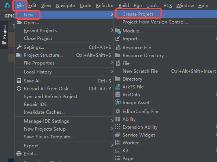
In DevEco Studio, find File->New->Create Project in the top left corner.
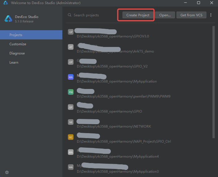
Or click create directly on the welcome interface.
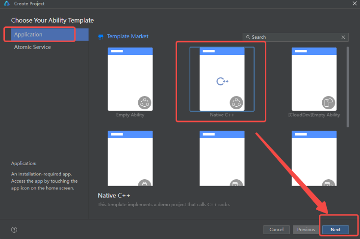
Since we need to call C language command line programs through NAPI later, we choose Native C++ here.
Note
(Note: If you choose other templates, you cannot link to related functions for use under "xxx\entry\src\main\ets\pages\Index.ets"!!!)
How to modify according to the figure content.
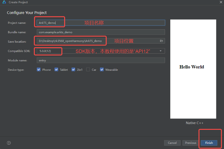
Wait for the compilation prompt to prompt that creation is complete.
If you want to see the display on the development board, go to File->Project Structure... in the top left corner.
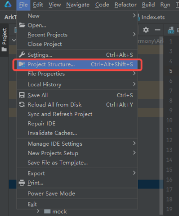
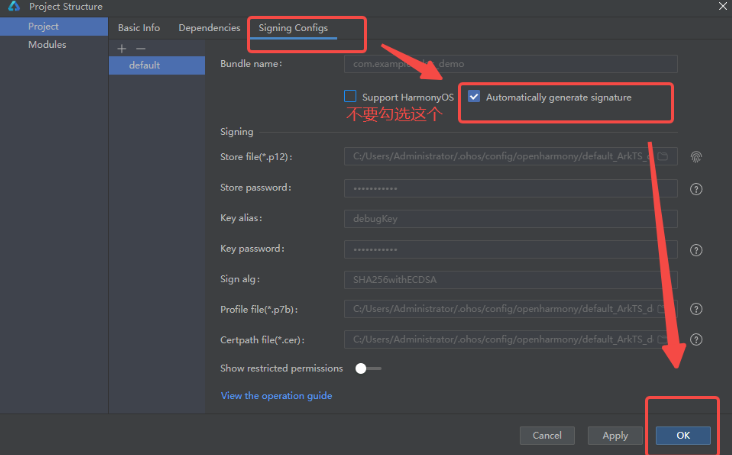
After configuring as shown above, click OK. It will automatically generate related dependency files based on your local computer.
Tip
If you open someone else's project and encounter compilation errors, you just need to reconfigure this step.
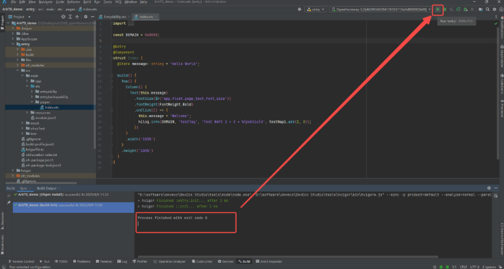
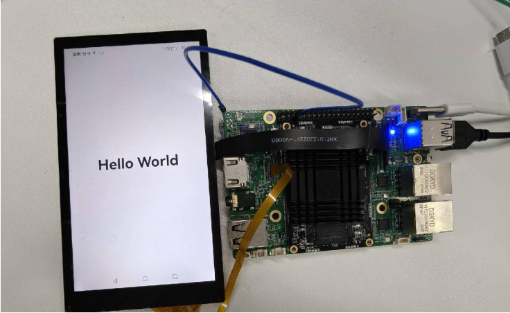
After waiting for configuration to complete, connect the development board's OTG interface to the computer. Click run in the top right corner. You can see the initial "Hello World" on the development board.
2 Basic Syntax Introduction
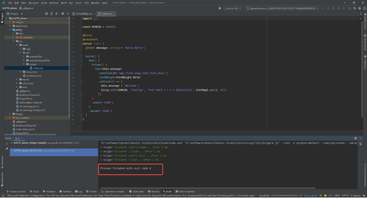
Below is the default initialization code generated by the template. We will use this to introduce some common basic concepts. For specific ArkTS syntax, please refer to our northbound development tutorial. Friends with experience in Qt, LVGL and other graphics library development will get familiar very quickly.
2-1 Layout
There are several types of layouts:
| Layout Type | Description |
|---|---|
| Linear Layout (Row/Column) | Arranges child elements linearly in horizontal or vertical direction. |
| Stack Layout (Stack) | Makes child elements stack on top of each other. |
| Flex Layout (Flex) | Similar to linear layout, but supports child components to scale or compress proportionally. |
| Relative Layout (RelativeContainer) | Allows child elements to freely position in 2D relative to container or other child elements through anchor rules. |
| Grid Layout (GridRow/GridCol) | Assists positioning through grid system, implementing responsive layout. |
| Media Query (@ohos.mediaquery) | Dynamically modifies application styles and layout based on device type or state (such as screen orientation, dimensions). |
| List (List) | Efficiently displays structured, scrollable data. |
| Grid (Grid) | Powerful uniform distribution layout capability, can precisely control rows and columns occupied by child components, adjusting proportionally. |
| Swiper (Swiper) | Implements loopable scrolling carousel effect. |
Here we only introduce linear layout, divided into Column (vertical linear layout) and Row (horizontal linear layout).
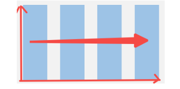
Horizontal linear layout means putting components on different columns of the same row. It can be understood as the vertical coordinate remains unchanged while the horizontal coordinate changes!
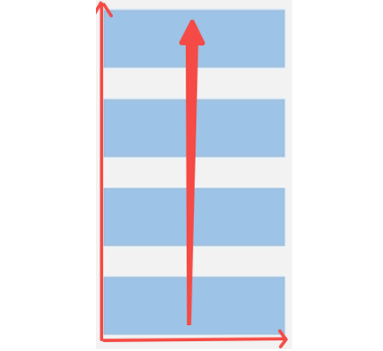
Similarly, vertical linear layout means putting components on different rows of the same column, that is, the horizontal coordinate remains unchanged while the vertical coordinate changes!
2-3 Components & Demonstration
Common components include:
- Button
- Radio Button
- Toggle Button
- Progress Bar
- Text Display
- Text Input
- Custom Dialog
- Video Player
- XComponent
This tutorial will first introduce text display and button components, which can basically meet the needs of this tutorial.
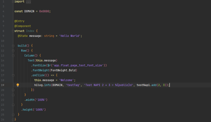
We trim the code text as follows:
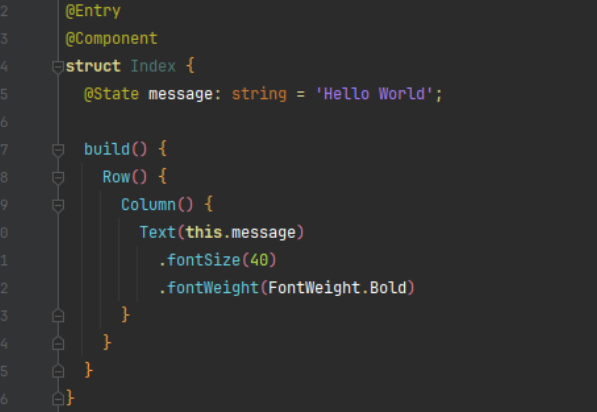
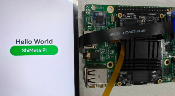
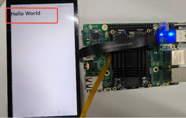
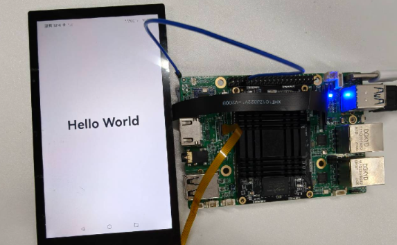
The function implemented by the code is to place a text, with size 40, style bold. Running on the development board, the effect is as follows:
Then modify the code:
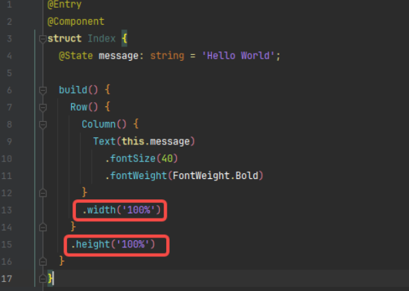
.width('100%') makes the vertical layout width occupy the entire screen width, centering the text horizontally.
.height('100%') makes the horizontal layout height occupy the entire screen height, centering the text vertically.
We add a Button component in the existing vertical direction, then add common attributes:
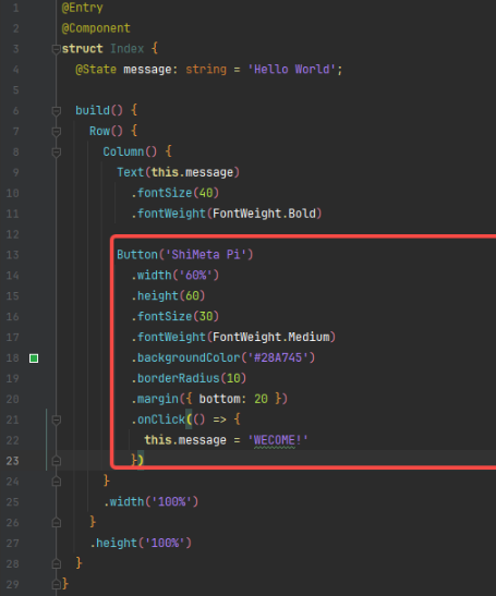
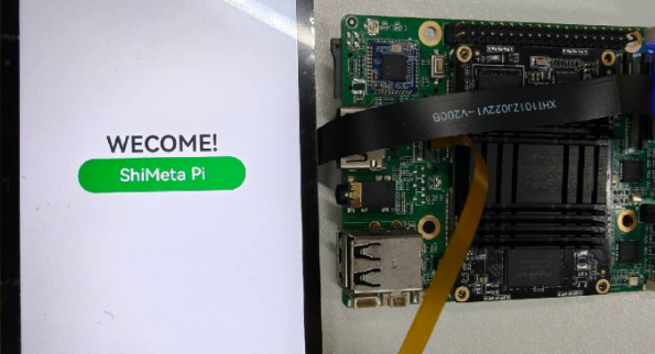
.width('60%'): Set button width to 60% of parent container. Using percentage units allows the button to respond to parent container size changes..height(60): Set button height to 60 pixels. Fixed height makes the button maintain consistent visual size on different devices..fontSize(30): Set button text size to 30 pixels. Larger font makes button text more readable and prominent..fontWeight(FontWeight.Medium): Set font weight to medium. This makes the text appear bolder than normal, but not too heavy..backgroundColor('#28A745'): Set button background color to green (#28A745). Green usually indicates positive, successful actions..borderRadius(10): Set button border corner radius to 10 pixels. Rounded corners make the button look more modern and friendly..margin({ bottom: 20 }): Set button bottom margin to 20 pixels. This creates visual spacing between the element below..onClick(() => { this.message = 'WECOME!' }): Set button click event handler. When user clicks the button, it changes the message variable value to 'WECOME!'.
The effect before and after clicking the button is shown in the figures below: